Let's start from the definition.
Technical analysis – is the research of market that uses different charts (candlestick, bar etc.) to predict movement of price.
Market price never moves in one direction slowly and monotonously. However, this movement is not spontaneous. Look at the chart 2.6. We can see that prices touch certain levels and somewhere they go through these levels with big leaps up and down, then they go back and strike the levels again. These are the levels of resistance or support which are the first of the most important objects for studying in technical analysis.
Resistance level, RES – is a horizontal line connecting the row of local highs (maximum prices). When price reaches this level, it's a signal to sell for bears. Upon reaching the resistance level, the number of selling offers is significantly increasing. Of course, it leads to dropdown of price and chart goes down along the level of resistance (chart 2.6).
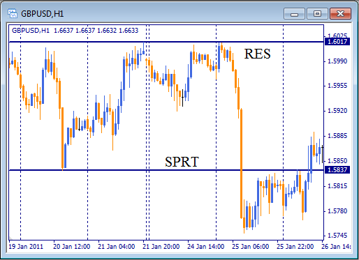
Pic. 2.6. How to read support (SPRT) and resistance (RES) levels on technical analysis chart
Support level, SPRT – is a horizontal line connecting the row of local lows. When price reaches it, this is a signal to buy for bulls. Upon reaching the support level, the number of purchasing offers is significantly increasing. It leads to growth of price and chart goes up along the support level (Fig. 2.6).
These levels represent psychological barriers in mind of market's participants. Movement between the levels can repeat several times till one of the levels for some reason will be broken. There is a rule in reading technical analysis chart: resistance levels often become support levels and vice versa (Fig. 2.6).
Levels of resistance and support are united in one term "consolidation or congestion levels"
Consolidation levels represent areas, where price movement is slowing down can be essentially regulated according to the power of its slowdown. Level, which was reached by price two times within the last two days is not so important as, for example, that level, where price fluctuated the last week. Also, consolidation levels are more significant on long-term periods rather than on short-term charts.
Apart from duration of consolidation level, the volume of trade (or activity of quotes) is an important factor too. The higher the activity of the market participants is, the stronger this level is.
There is one more rule: the stronger level of consolidation is broken, the further chart will go. So there is one important question: when crossing of the level can be considered as its break? If a bar or candlestick on chart crosses the resistance level, can we consider it as a broken level? Close price is considered to have major importance in this case. If candlestick on chart crosses the resistance level but then closes below it, this is not a break. If Close takes place above the Resistance, it tells about coming breakthrough (pic 2.7).
The main analytical point of consolidation levels is the following: it gives a signal for a probable opening in a certain direction. When price reaches Resistance, be ready to open short position (Sell). It's very likely that chart will bounce from this level and go down. And vice versa, if price reaches Support, this may be a signal for opening long position (Buy), as chart may go up in this case.
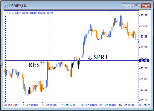
Fig. 2.7. Resistance level lasted for 5 days and was broken only by the 6th attempt on USD/JPY chart.
In technical analysis, a special line – trend line (or tendency) – represents a general direction of price.
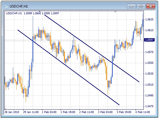
Look at the Fig. 2.8. On this picture, the chart looks like steps going down. Resistance levels on this chart change each other over the time, each new resistance level is below the previous one. By connecting these levels with a straight line (the resistance line) we will get a downtrend.
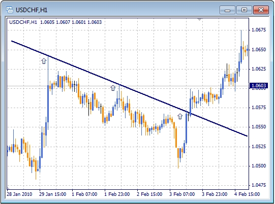
Fig. 2.8. Downtrend on USD/CHF chart with H1 time frame.
If support levels tends to grow up, then the line connecting these levels is called uptrend or support line as it is shown on the pic.2.9.
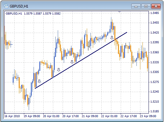
Fig. 2.9. Uptrend on GBP/USD chart with H1 time frame.
The more price points on consolidation level are, the stronger trendis. Of course, sooner or later direction of price will change as the trend reverses. Trend's reversal is represented by change of direction following to the penetration point. If penetration point confirms reversal of uptrend, it gives signal to sell. Confirmed reversal of downtrend gives a signal to buy.
Let's sum up. Trend can be different: downtrend, uptrend or flat (horizontal trend). Uptrend is determined by support line, downtrend is determined by resistance line. And if trend goes horizontally it is represented by both of resistance and support levels. In this case, we have corridor or flat (Fig. 2.10).
The term power is very important for consolidation levels as well as for trends. Trend's importance is determined by the following factors:
The more power of trend has, the more reasons to trust it we get. But if this trend is broken, breakthrough will be very large.
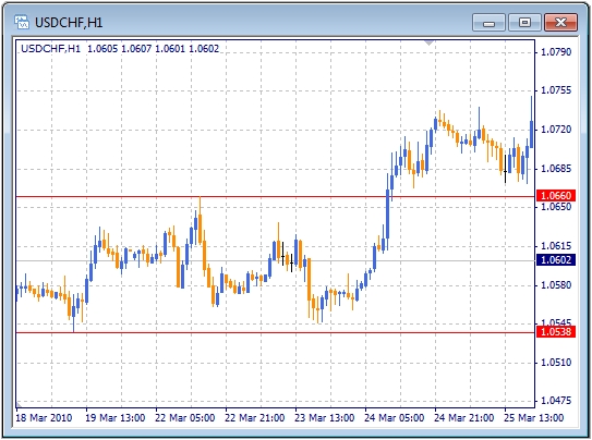
Fig. 2.10. Corridor or flat on USD/CHF chart with H1 time frame.
An important characteristic of trend is its inclination. It tells how fast price grows and therefore, forecasts a potential income in this market.
Dynamics of market has one interesting feature: trends on this market often have the same steepness. If some time after breakdown of ascending trend the market (even if it lasts more than was expected) reveals a new uptrend, its steepness will be the same as the previous one has. You can see the example on Fig. 2.11.
As for breakthroughs of trend's line, it is the same as for consolidation lines. Close of candle after breakthrough of trend line above the downtrend (or below the uptrend) is a signal for a change of tendency, which is much stronger than simple cross of the line by a candlestick.
Besides, replaceability is also very important for trends. Following to breakthrough of uptrend , the chart comes back to it and trend becomes a resistance line (Fig. 2.12) And on the contrary, following to breakthrough of downtrend, the chart rolls back to the trend line, which now becomes a support line.
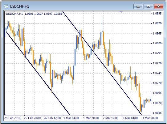
Fig. 2.11. An interesting feature of trends: their steepness are the same in neighboring areas. GBP/USD chart with H1 time frame.
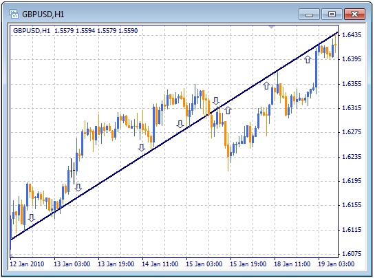
Fig. 2.12. Uptrend line (support line) becomes resistance line on GBP/USD chart with H1 time frame.
If trend is obvious (for example, we can determine whether it is uptrend or downtrend), it becomes an analytical tool. With its help, an analyst can choose Opening time and predict the results (that is to say, Closing). When price approaches trend line, it tells about the possibility to open a position. Having bounced from a downtrend, chart will go down, approach of price to a downtrend is a signal to open short position. The same way, approach of price to an uptrend is a signal to open long position.
With the active trend, price fluctuation is often within a range bordered from the top and the bottom. This range can be fixed and as a result we receive a line inside which the chart moves (Fig. 2.13). This is an example of channel created by trend and consolidation lines (channel line). In particular, borders of upward channel are made by uptrend and resistance line which is parallel to the uptrend. Respectively, for downward channel these are downtrend and support lines. When trend and channel line are horizontal, the channel is called a corridor.

Fig. 2.13. Example of price channel on EUR/USD chart with H4 time frame. Also, there are signals for trades.
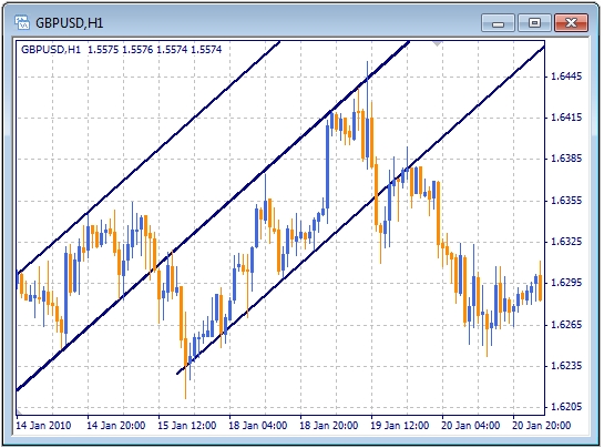
Fig. 2.14. Price doesn't reach the trend line and after the line breakdown a new channel emerges.
Pic. 2.15. Fig. 2.15. Price doesn't reach the channel line and breakdown changes the trend.
Technical indicator – is a chart of mathematical function built on the basis of price's dynamics or volumes (of activity).
The below trend indicator is the most popular among traders and is called moving average, MA.
In the simplest cases its value are the same as average price value for a certain period, which is called the moving average parameter. The rules based on moving averages are the most popular tools of technical analysis, as they don't require expertise and their usefulness can be easily explained without complicated mathematical formulas.
There are several types of moving averages. The most popular are: Simple MA, weighted MA and Exponential MA. Each of them is calculated according to its own formula, that's why their charts are different. To understand their operation principles, we will consider the simple MA.
Simple MA is a price average value for a certain period. For example, five-day's SMA shows average prices for last 5 days, 20-day SMA — for the last 20 days and so on. The common formula to calculate the SMA for n days is following:
where n is an averaging period, P(1) is today's price, P(n) — is the oldest price in n-period.
It's clear that the more n value are there, the smoother SMA chart is. But at the same time, its changes along price's changes are delayed. Usually the n value shouldn't be more than 3. The maximum value of n is limited only by amount of data (which in fact is not limited).
The average moving rate helps to see the direction of the market. Main signal from the MA is the direction of its change. When it grows, you should buy, when it falls, you should sell.
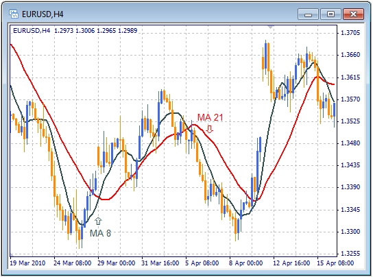
Fig. 2.16. SMA for EUR/USD chart with H4 time frame.
Working with MA means handling with two types of signals. The first type consists of all signals which produced by MA itself. The second one includes all signals produced by their combinations.
To determine reliability of signals produced by MA, their combinations (two or more lines) are used. For example, combinations of averaging periods 8-27 or 5-13-24. Comparing the positions of different MA, we can determine trend on long- or short-term periods. Big MA means that there is trend is on long-term periods (for example, day-period or week-period) and little MA say that there is trend is on short-term intervals (for example, hour-period). So, each change in direction of short MA and especiallt its cross with a big one means that soon more important tendency will change too.
Fig. 2.16 Shows how the crossing of the MA lines with different periods gives a signal of trend's reversal.
Read technical analysis prepared by experts of "FreshForex" dedicated to trend potential.