One of the main functions of the terminal is inform a trader about price movements made within a specific period of time. Originally, this information was recorded by traders on paper, but as the computer technology moves on, it all changed and now a trader's task is just a proper launch and configuration of the terminal's window. In this window, he gets live currency trading charts ready.
The most detailed information on changes of price is given by a currency trading tick chart which displays each new quotation. Each change is reflected by a vertical movement and by a small horizontal step. Therefore, when market is active (when a lot of operations are conducted) for a certain period of time, plenty of price fluctuations take place and chart line begins to "tweak". With passive market, quotes are updated not very often and on live currency market chart we see a little number of ticks over the same period of time.

Pic. 1. EUR/USD tick chart (24.05.2010).
When all quotations are present on currency trading charts, we will have analyze a big deal of data. To avoid this, we should divide time into equal intervals. Then, we choose from one to four points as a "representative" of this particular time interval from all set of prices ahd get a clear currency trading chart ready.
Nine time frames available for each financial instrument in MetaTrader: 1 Minute – 1M, 5M, 15M, 30M1 Hour – 1H4 Hour – 4HDay – DWeek – W and Month – MN. Wide range of instruments in MetaTrader allow you to create schedules with other non-standard intervals, such as 20 minutes or 6 hours if needed.
In MetaTrader 5 there are 21 timeframes available: 1M (Minute), 2M, 3М, 4М, 5M, 6М, 10М, 12M, 15M, 20M, 30M, 1H (Hour), 2H, 3H, 4H, 6H, 8H, 12H, 1D (Day), 1W (Week) and 1MN (Month).
Pic. 2 shows line chart, which reflects change in prices over a certain time period. Line chart is a sequence of prices fixed by the standard time interval. These values are connected with each over by straight lines. Obviously, the smaller time interval, the more accurate chart reflects fluctuations of the currency rate.
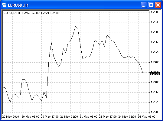
Pic. 2. EUR/USD line chart (24.05.2010).
Bar chart or bar shows four important prices that are specially selected within a specified time interval.
All four prices are reflected in bars in a special way. The principle is the following: High and Low are vertically connected, whereas Open and Close levels are marked:
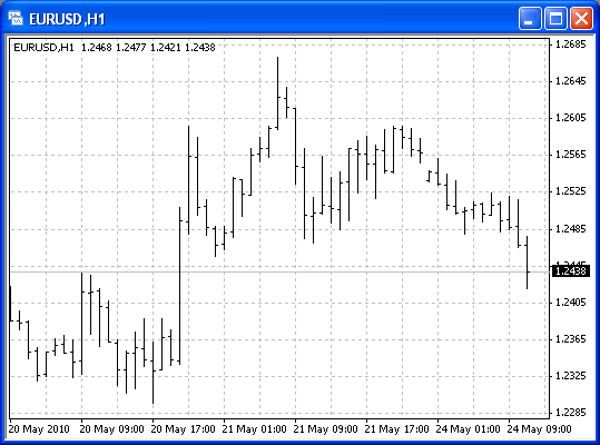
Pic. 3. EUR/USD bar chart (24.05.2010).
As we can see from the Pic. 3, bar charts are very simple for understanding. At first glance, you can determine, from where trading begun in a given time frame, Highs and Lows (extremes) of price and its value at the end of this time frame. Please note that since bar is based on four prices, equal bars can be formed even when tracks are different.
The oldest form of chart and analysis is, of course, a japanese candlestick favored by traders a lot.
Candlestick charts were invented in Japan as early as in the 17th century. They came to the western technical analysis in the late 1980s and became popular immediately. The reason is that "candles" provide more information about the internal dynamics of the market.
Candlesticks, shown in the Pic. 4, are similar to bars in their structure and sense. Main elements of candles and bars are the same: Open, High, Low and Close. But Open and Close are connected not by a thin stick, but the with "body" of the candles in the form of a rectangle.
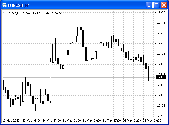
Pic. 4. Candlestick chart (24.05.2010).
If Open price is less than Close, i.e., price moves up, then candle's body is represented by a white rectangle. If Open is above Close, i.e., price moves down, then body of the candle is black.
Above and below candlestick body is painted as shadows. They connect candle body with maximum (high) and minimum (low) prices for a time period.
If High and Low prices are equal to Open and Close (open or close = high or low), then there is no shadow. If open = close, then candle body is transformed into a horizontal dash. This is called a doji candle).


 en
en  cn
cn  id
id  ar
ar  ru
ru  vn
vn  es
es  pt
pt  kz
kz  ua
ua  tj
tj  uz
uz  az
az  ms
ms