We've considered fundamental and technical analysis. Also we have learned basic terms of technical analysis: support and resistance, trend and channel lines. We've been watching the prices for many years and it shows that different combinations of these lines create Forex pattern chart figures — the patterns of chart analysis usually expressed in candlestick form. These price patterns give us some information about participants of market. And as they regularly appear on Forex charts, many traders use price patterns to predict future price.
There are two types of price patterns in chart analysis:
The first and the most important model of reversal "Head and shoulders". A typical configuration of this figure is represented on the picture:
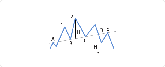
Geometrically, "head and shoulders" repesents three subsequent Forex peak points on the top of ascending candlestick chart. These peaks make up a typical configuration – the left shoulder, the head and the right shoulder. The last one is based on the neck line. This model of market dynamics is simplified a lot, but it renders main points of patterns' formation. Since a lot of factors influence on market, exchange rate is often deviates from an ideal form. Let's watch at the picture more closely. The neck line as a resistance level usually is painted as the last peak before forming the figure. After breaking this level at A, price forms the maximum of the left shoulder and falls to B. Having bounced from this point again, the price forms a higher maximum of the head and returns to C. It confirms that the neck line based on A, B and C now has become a support line. The maximum reached after bouncing from C makes the right shoulder. And finally, the price breaks the neck line - this very moment means ascending trend is broken. Forming of the "head and shoulders" has been finished. Often further to breaking the neck line, the price returns to this line from below (E) and then finally goes down.
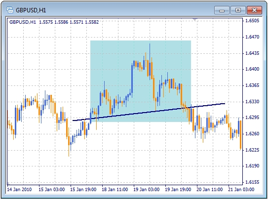
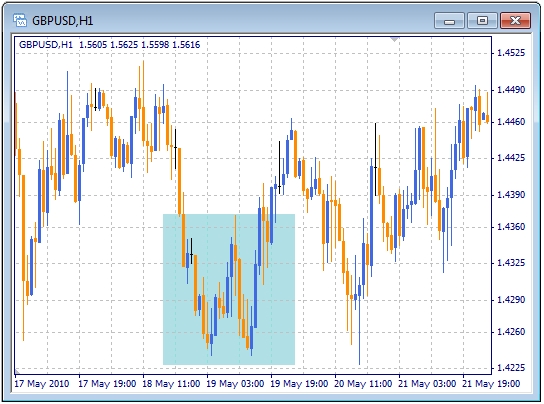
It's very important that "head and shoulders" pattern can forecast the duration of to price movement after the break. Look at the picture: H height is determined by projection of the top of head on the neck line. This way figure tells us that price would move down at the distance measured by H from the break point of the neck line (D). But it requires the time comparable with formation of the "head and shoulders" pattern. There is an example of classical "head and shoulders" pattern accounted on GBP/USD chart:
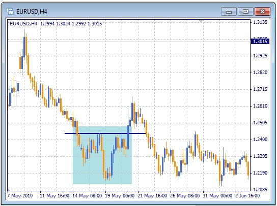
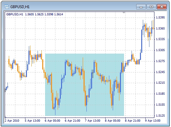
On the chart below there is an example of reversed "head and shoulders" (which happens on the market too). Formation and signals are similar to the pattern registered on the top of the market.
In conclusion we'd like to note that deviation from typical dynamics in formation of this pattern is quite unpleasant. It can happen that price chart won't draw the "head and shoulders" we want to see, but will turn where it (not we) wants.
The next Forex pattern of uptrend's reversal is called "double peak". In the previous model the second peak (head) is higher than the first one. In double peak the peak of the same level emerges on ascending tendency further to one peak. Since price doesn't go up, the trend can't be saved and finally the price falls even lower than the last low.
Probably, you've already guessed that like in "head and shoulders" pattern, height of double peak tells us how far it would move down from the break point.
Of course, this pattern also has its back side - double bottom.
All of the aforesaid about double top can be applied to this pattern too. But there is a difference. The double bottom is formed at the bottom of market and represents the break of downtrend.
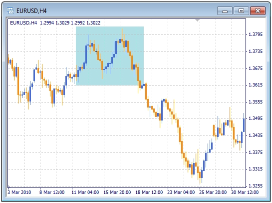
Also there is triple top and bottom.But we won't consider them in details as they are quite seldom appear on charts of currency market. But just in case there is an example below:
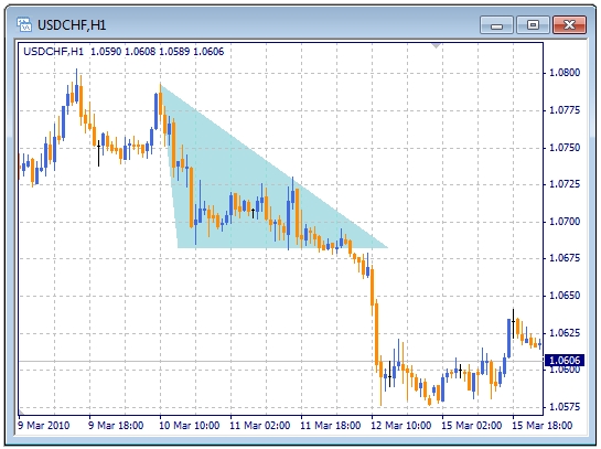
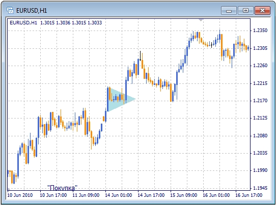
The most typical price continuation pattern is the triangle and its various forms. One of them is a symmetrical triangle created by two converging lines of consolidation. As these lines are almost symmetrical, this triangle means that forces of bears and bulls are equal. Nevertheless, there are some patterns in this model. If the previous trend is uptrend, then symmetrical triangle probably will go up. If the previous trend is downtrend, then triangle will go down.
To build triangle on chart, it's important to have at least two pairs of points on the consolidation level: two of support and two of resistance. Two straight sides of the triangle are drawn exactly through these points.
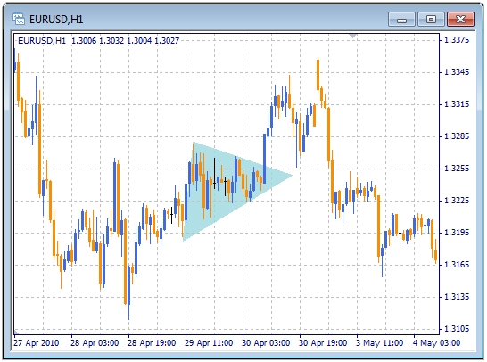
If close price of candle is surely beyond one of corresponding sides of triangle (to the side of continuation), it is taken as break of the triangle. A mere intersection of side for sure gives a false signal. Moreover, after the break, chart usually goes back to the broken side and then price goes along the previous uptrend. When price very closely approaches the triangle's top, it leads to uncertainty and often diminishes the probability of tendency's continuation.
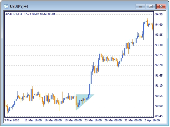
The next model - ascending triangle - has a horizontal upper boundary and the ascending lower boundary. Such disposition means that demand is stronger than supply. Buyers try to use each prices rollback down for opening the position to buy. That's why the levels rollback of price to open buy positions, so every time rollback become higher and higher. So the ascending triangle predicts that market will move up.
Descending triangle has a horizontal downside and descending upper side. The descending triangle signals that supply is higher than demand, so it predicts that market would go down.
All the triangles formed as continuation patterns have one feature: the major trend continues up to the triangle's top (intersection of consolidation lines) and then there is a probability of its break.
The next models are pennants and flags. They often emerge to correct intesively developing trends. Patterns are represented on the picture below. You can easily notice that they represent a certain suspension of trend's development. In fact, the pennant is a little triangle. And the flag is a minor price channel as though "worn" located on the previous course of chart.
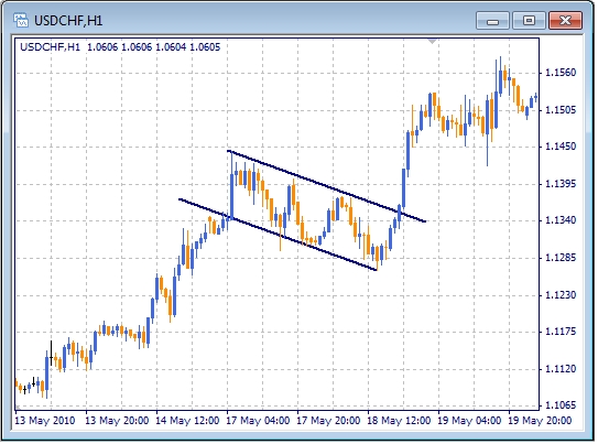
It is noteworthy that further to breakdown of pennant or flag, the chart goes the same distance as it took to move to the figure (before the fugure). Also it can be noticed that figures are more reliable when they are targeted against the previous trend. But there is another point to be made. If this pattern does not resist the trend and are built along the trend, they are likely to indicate a possible reversal.
Conclusion: chart analysis makes the market more dynamic. When we know different patterns, we can predict the price movement. And at last let's remember that there is no universal type of analysis. All of them are good together.


 en
en  cn
cn  id
id  ar
ar  ru
ru  vn
vn  es
es  pt
pt  kz
kz  ua
ua  tj
tj  uz
uz  az
az  ms
ms